#articleCont {
font-size: 16px;
line-height: 1.6;
color: #333;
word-wrap: break-word;
}
#articleCont :first-child {
margin-top: 0 !important;
}
#articleCont h1,
#articleCont h2,
#articleCont h3,
#articleCont h4,
#articleCont h5,
#articleCont h6 {
margin: 40px 0 20px;
}
#articleCont h1 {
font-size: 24px;
}
#articleCont h2 {
font-size: 22px;
}
#articleCont h3 {
font-size: 20px;
}
#articleCont h4 {
font-size: 18px;
}
#articleCont h5 {
font-size: 16px;
}
#articleCont i {
font-style: italic;
}
#articleCont p,
#articleCont div {
word-wrap: break-word;
margin: 14px 0;
text-align: justify;
}
#articleCont blockquote {
border-left: 6px solid #ddd;
padding: 5px 0 5px 10px;
}
#articleCont blockquote p:last-child {
margin-bottom: 0;
}
#articleCont .simditor-body blockquote :last-child {
margin-bottom: 0;
}
#articleCont a {
color: #82b64a;
}
#articleCont a:visited {
color: #82b64a;
}
#articleCont a:hover {
color: #74a342;
}
#articleCont img {
max-width: 100%;
height: auto;
}
#articleCont hr {
margin: 19px 0;
border: none;
border-top: solid 1px #ddd;
}
#articleCont ol {
list-style-type: decimal;
}
#articleCont ol li {
list-style-type: decimal;
}
#articleCont ul {
list-style-type: disc;
padding-left: 40px;
}
#articleCont ul li {
list-style-type: disc;
}
#articleCont table {
width: 100%;
font-size: 12px;
border-collapse: collapse;
line-height: 1.7;
}
#articleCont table thead {
background: #f9f9f9;
}
#articleCont table th,
#articleCont table td {
border: solid 1px #ccc;
text-align: left;
vertical-align: top;
padding: 2px 4px;
height: 30px;
min-width: 40px;
box-sizing: border-box;
}
#articleCont pre {
white-space: pre-wrap;
}
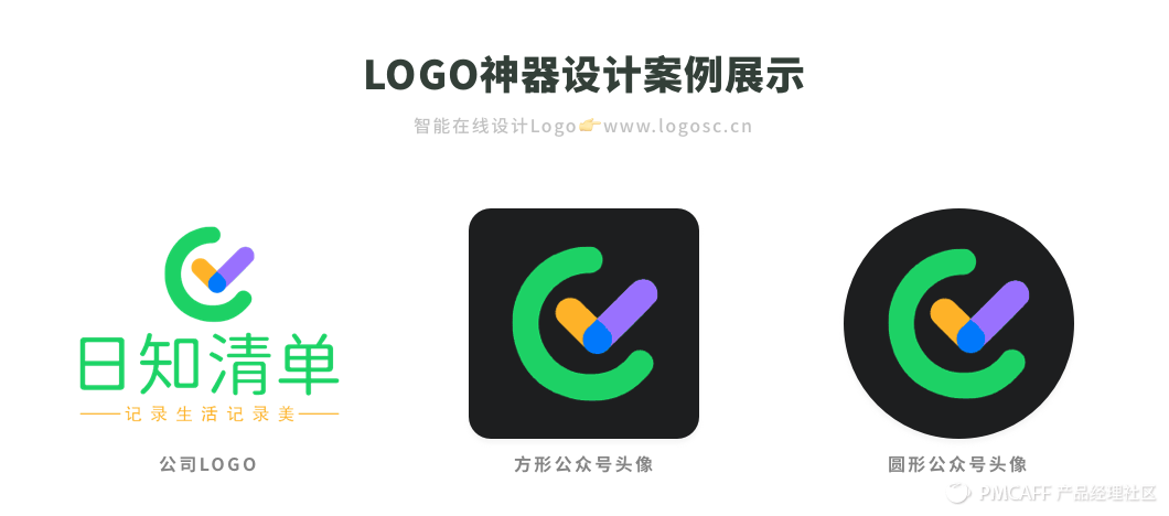
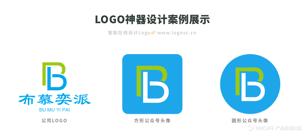
在自媒体时代,微信公众号成为了打造个人品牌或者创业起步的重要新媒体渠道,特别是在公众号多次改版之后,一个好看有吸引力的公众号Logo设计对于账户活跃度更加重要了,甚至会左右用户是否会打开阅读文章。今天和大家分析,公众号logo到底应该怎么设计?提炼出了这4大套路!
1.字母/汉字公众号Logo
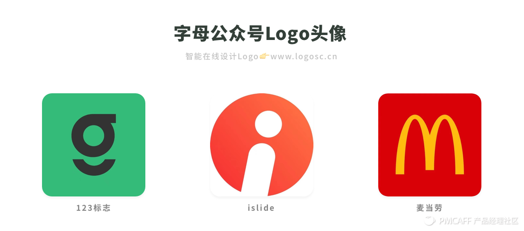
大部分人手机里关注的公众号少说都有几十个,想要用户看一眼就能够记住你,最关键的是信息简单,突出重点。你的公司logo可以是文字+图形组合,但是公众号头像一定不可以把公司名称、图形、英文名称等这些信息全部堆上去。
通用的套路就是,使用公司名称的首字母/汉字,比如麦当劳的英文首字母变形「M」,123标志的「g」字母变形,这些头像在一片花里胡哨的图形中间,显得非常简洁,明确具体。
2.纯文字公众号Logo
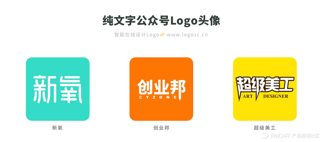
直接使用品牌名称/公众号名称,来进行纯文字logo设计也是最常见的公众号头像设计方向,常见于企业品牌公众号或者是要打造个人ip的自媒体上。这种头像非常简单直接有效,在培养用户阅读公众号内容的过程中,潜移默化地输出品牌概念。比如:新氧、创业邦、超级美工等。
3.ip图形公众号Logo
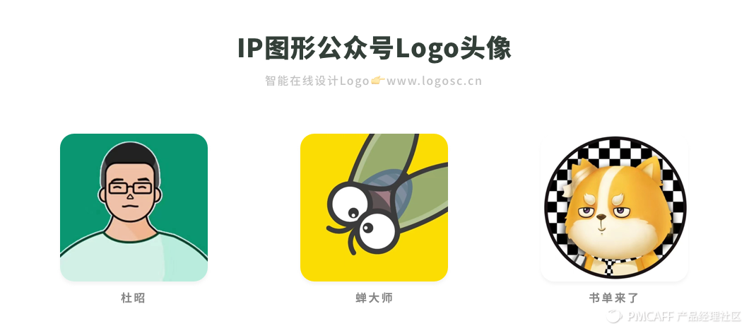
如果你想要自己的公众号更有趣拟人化,可以使用自己的的个人ip图像、公司吉祥物、虚拟的动物图像等,如果想要强化公众号品牌的行业属性,可以使用该行业的代表特征图形。比如:蝉大师、书单来了、杜昭等。
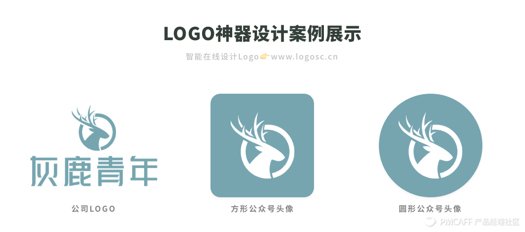
如何提取公众号的ip图形?可以从公众号的名称、行业、产品业务等方面,比如下面案例中的公众号「灰鹿青年」可以用一只卡通小鹿图形作为公众号头像。
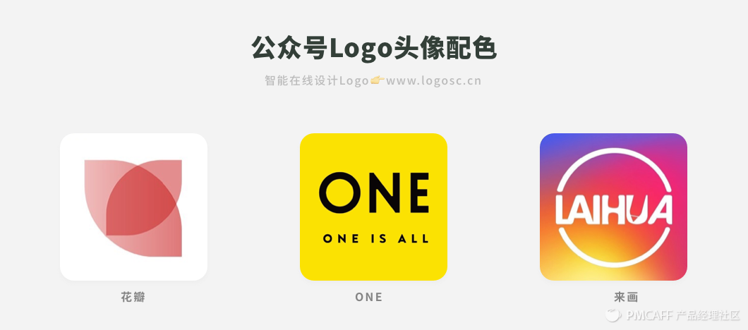
4.公众号Logo配色技巧
公众号logo头像配色需要注意的是,颜色数量精简到三种以下,两种对比色是最佳的,色彩饱和、亮度高。一般可分为三类,以白色/黑色做底色的logo,比如花瓣;以品牌色做背景色的logo,比如ONE;以渐变色做背景色的logo,比如来画。